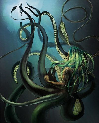
An octopus man. I want to go back and fix this because I had a lot of issues with Photoshop crashing and having to restart it -- thus I had to rush. A few edges look really bad up close. But overall I'm pretty pleasantly surprised with it.
I love painting this character -- he's created by a friend, though I help conceptualize him sometimes. Tentacles are awesome. You just put them where you need more compositional shapes. Like, what more do you need.


Nice hair. Very nice hair, but the black/white contrast around the victim is killing your space. Distant objects should have the least contrast, even if they are closer to the light source. Check out James Gurney's tips on underwater painting:
ReplyDeletehttp://gurneyjourney.blogspot.com/2010/01/color-underwater.html
But nice hair man...
Awesome resource. I definitely need to go back to this and clean up my edges. Thanks a lot for the tips, especially the illusionism one. I didn't think of that but you're absolutely right.
ReplyDelete